Monday 28 March 2011

Arm Facings

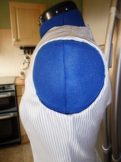
The next step to finishing this dress is to finish off the armhole., to do this I inserted an arm facing.

This is what it looks like now that it is finished.
I found inserting an arm facing hard and think that I could have done it better. The second one that I completed was better than the first and I think that I am more confident now I have completed them on this dress as they are more familiar to me. One problem that I came across when doing this was that I lined the seam of the facing with the shoulder seam instead of the side seam, I have definitely learnt from this and I am more aware of checking this now.

Neck Facing

As I mentioned in a previous post we have made a dress with a 'V' Neck, but the edge around the neck and the armholes are still unfinished.

The first step that we took to finish these edges was to finish the neck so we inserted a facing.

This is what the finished edge looks like.
After completing a neck facing on this dress I feel that I will be able to apply this in the future to dresses that I make. One thing that went wrong was that the 'V' neck has ended up wonky, I don't know why this has happened but if I was to do it again I would try and be more careful.

Monday 21 March 2011

Time to Change - Mental Health advert

I was watching the TV and came across this advert; I feel that it relates to the current brief really well and shows the theme of Equality and Diversity through the subject of mental health really well.

Equality and Diversity

For the new brief one of the tasks is to research into equality and diversity, we have to do this as this is the general theme of our designs. To start my research I decided to come up with a mind map including the main headings that I could research into. These are the subjects I came up with:
  • Disability
  • Age Discrimination
  • Social Class
  • Size Discrimination
  • Sexual Orientation
  • Gender
  • Religion
  • Race
I will be looking closely at these subjects and researching into how these subjects lead to discrimination and including my opinion on them.

Grain or Bias

Recently in our pattern cutting lessons we have made a dress block, from this we have been able to create closing fitting dresses with a 'V' neck and zip in the back.
The first dress that we made was cut on the grain line. This meant that the dress fitted the body well and showed off the curves of the body. Also the bottom hangs straight and creates an elegant look.
The second dress that we made was cut on the bias line. This was a lot harder than the first one as the fabric has more stretch therefore the is harder to sew on the machines.
The main difference between cutting on the grain line and cutting on the bias line is how the fabric hangs. As you can see from the pictures the one cut on the grain line hangs straight and the one cut on the bias doesn't. Another difference is the way that the zip sits; on the first dress which was cut on the grain line the zip fits well but on the second dress which was cut on the bias the dress doesn't fit well therefore if I was to make a dress on the bias line in the future I would incorporate the zip into the side seam rather than in the back.

Saturday 19 March 2011

New Brief

On Thursday we were faced yet again with starting over on a brand new brief; even though looking through a book full of empty pages after just handing in a full one can be quite daunting it is exciting at the same time as we get to look at a different aspect and are able to start fresh.

I really like this brief and feel that the theme Equality and Diversity will be good to represent and portray through my designs.

Wednesday 16 March 2011

Evaluation of the Brief

For this brief I have been asked to research into brand identities that would help to influence my final outcome, either packaging or an accessory. When I first read the brief I was excited as this is a vital part of the industry but excited to see what I would be able to create.

The first task that I was asked to do was research into a number of brands and their identities. I looked at; Guess, Celine, Tiffany and Co, Pandora, Marc Jacobs, Juicy Couture, Mars, Highland Spring, Casio and HP. Out of all these brands the ones that have inspired me the most were Marc Jacobs and Celine. Marc Jacobs inspired me with his youthful, simple advert designs and the elegance of the Celine brand inspired me. The brands that inspired me the least were Casio and HP. Casio didn’t inspire me because I thought that the brand didn’t really have anything special and the HP advert was too busy for me. The Tiffany and Pandora brands have some similar properties such as the use of colour association. Whereas the Marc Jacobs brand isn’t just associated with one colour.

Next we were asked to create a 250 word written piece comparing and contrasting two brand identities. I chose Guess and Juicy Couture. I chose these two brands as I feel that even though they appear to be different there are some similarities such as how both brands use the idea of creating a sexy image to sell their products.

Then we were asked to experiment with different techniques and media to achieve different messages. I did this by recreating the brand adverts to appeal to different audiences using the appropriate media to do this. From doing this I learned how to communicate certain messages through the media that I used and through how the adverts layout. This task particularly helped me with the final outcome by becoming more aware of how to convey a message through the advert.

Next we had to decide whether we were going to make packaging or an advert; I decided on an advert as I feel that I have learned the most about this and I was inspired by the adverts by Celine and Marc Jacobs. Once we had decided we had to design four adverts showing development. I feel that my designs show clear development and show my train of thought and my target customer. I am pleased with the designs and feel that I have been able to convey my idea well through these.

After I had designed my advert I created it, I did this by firstly doing a photo shoot to get my picture then I edited this on the computer so that it fitted my design and appealed to my target audience.

Finally we had to pitch our advert or packaging to the group; beforehand I felt quite nervous about how we were going to have to present it, but when I was there I felt prepared and ready to pitch it. I feel as though it went well and I had completed my work in enough depth that I could explain it properly. Having this before the deadline helped me with my time management as I have a couple of days to finish of any little bits that I have left to do.

During this unit I feel that I have progressed in the advertising area of the fashion industry, also I feel that I have improved my analysis skills this is because I am able to critically analyse the messages that brands are portraying. The thing that I have improved the most during this brief is my editing skills but I still feel that these can be improved.

Comparing Juicy Couture and Guess?.

Juicy couture and Guess? are two major brands who’s advertisements are shown to us in our everyday lives; whether it be in magazines, on the television or worn by our favourite celebrities as brands they are pushed to the forefront of our lives.

Established in 1996 the Juicy Couture phenomenon was started by co-designers Pamela and Gela. Their original plan was to make sexy basics for their friends but their designs were so popular that they have now become one of the top designer brands on our high street today.

Established in 1981 the Guess? brand begun as a Californian jeans company. With the brand creating a new market for designer denim after the surge in the 70’s was over. With their success as a denim brand being so great the brand expanded into a full label and is now at the forefront of our high street.

Both brands work around the idea of creating a sexy look for their brand, with Guess? it is more about the cut of their clothing and their iconic advertising campaigns, whereas with Juicy Couture it is also about the clothing but instead of the cut of the clothing I believe that it is the way that the garments are worn. Another comparison between these two brands is that they are both American brands and I think that elements of this come through in their advertising through the style of the models and the slogans that they sometimes use.

Both brands also differ in many ways. Juicy Couture is sold in department stores such as Selfridges as well as in its own outlets, whereas with Guess? it is sold in it’s own outlets but not in Selfridges. Another way difference is that Juicy Couture uses very girly colours and poses in its advertising, such as hot pink which they are famous for; Guess? uses very promiscuous poses and usually just a monochrome colour scheme making both brands differ greatly in advertising styles.

Both brands have a wide range of products from clothing to perfume to handbags to shoes. But some elements are very different, for example the perfume bottles from Juicy Couture are more youthful and decorated whereas the perfume bottles from Guess? are designed with simple lines and are more elegant in appearance.

No matter how many comparisons or differences that these two brands have both of them offer a lifestyle to their customer that they are buying into, I believe that this is the most effective element of advertising yet it is the one element that remains constant. All brands offer a lifestyle through their visual language. For the brand Juicy Couture this is a girly, rebellious lifestyle and for the brand Guess? this is a very sexual, image conscious, leadership lifestyle. I feel that brands create a lifestyle that is unattainable in our everyday lives and that buying that ne branded item makes the individual feel that they are achieving the lifestyle they long for.

Monday 14 March 2011

John Galliano Scandal


Recently we have seen the images and listened to the clips of the anti-semitic rant of John Galliano. Following these allegations he has been suspended and then fired from the Dior fashion house and is now awaiting trail. All this because of his 'racist' comments on a night out.

In a bar in Paris he has been seen to have made remarks such as 'People like you would be dead. Your mothers, your forefathers, would all be f****** gassed.' On the video he can be heard to say 'With you. You're ugly.' after a woman asks if he had a problem. He has also been accused of remarks such as 'I love Hitler' and threatening to kill one of the ladies that is pressing charges against him but this is not caught on the video that has been seen in the press.

Galliano has started legal action against two ladies for defamation and has denied the claims made by them but has made no comment about the leaked footage of him.

Personally, I feel that the remarks made by him are careless and have damaged his once respected reputation but we are not aware of the whole situation are and are only aware of the facts that we are given and the part of the evening that was recorded. I do respect him less than I once did but believe that he could have been provoked through the evening which wasn't recored.

For me the next step is to see who will be taking over his role at Dior and securing fashions top job.

Sarah Burton

Sarah Burton, the lady who took over the Alexander McQueen empire after his death in February 2010 has recently been included in the speculation around the designer of Kate Middleton's wedding dress.

As we all know in April this year Prince William is set to marry Kate Middleton, and as one of the most coveted fashion commissions of the year there has been a lot of speculation around who this honour will go to. Some of the names that have been included so far are Victoria Beckham, Vivienne Westwood and Sarah Burton. When asked Vivienne Westwood responded by saying 'I would have loved to have dressed Kate Middleton but I have to wait until she kind of catches up a bit somewhere with style' This may sound harsh on Vivienne Westwood's behalf but personally I cant imagine the elegant and somewhat reserved soon to be Princess wearing one of Westwood's innovative and rebellious designs.

Even though different names have been thrown about the one that has made to biggest press impact is Sarah Burton so does this mean that she is most likely the person to design the coveted dress? Personally I think it does but we could all be shocked as the event of the year approaches.

Sunday 13 March 2011

Second Advert.

While researching into the different brands one thing that I have noticed is that they have an ad campaign for each season and within this campaign they have a series of adverts. This inspired me to create another advert that we be suitable for a double page spread in a magazine.

This is what I came up with.
I think that they both stay within the same theme so you would be able to tell that they were part of the same ad campaign.

Photo shoot.

I have decided to create and advert for my outcome. I decided this over packaging because I have been inspired by the adverts of other brands that I have been researching. To get the picture that I wanted to use on my advert I asked a friend if she would model for me and thankfully she agreed.

In my kitchen I hung white fabric from the cupboards and covered the floor with it to create a plain background. I wanted a plain background so that the image would focus on the stockings and look simple and elegant.

Then I positioned her how I had designed and took the pictures.

This was the picture that I chose to use. I chose this one because it was the write angle and shows the stockings well.
After I had decided on the picture I wanted to use I started to put the advert together. After editing the picture and adding the writing in the font that I had chosen to represent the brand this is what I had made.

Creating my Logo

For the new brief we have been asked to create either packaging or an advert for an item that we have been given. You may have seen in an earlier post that I was given stockings.

These stockings didn't already have a brand to go with it so this meant that I needed to create my own brand. I decided that I wanted a name that sounded elegant and fitted the customer. I called my brand 'Belle Dame' this is 'Beautiful Lady' in French and I feel that it suits the product well.

Next I decided on my font, I wanted something that was also elegant but individual too. So I decided on this font off a website called dafont.com.
After I had decided on my font I started to put the logo together. I decided to pair it with an image that I thought was appropriate for my product that I found on the internet. I think that it has worked really well and would appeal to my target customer.

Wednesday 9 March 2011

Hoodie, Hoodie, Hoodie ...

Over the course of our pattern cutting lessons, a couple of us have spent our time making a hoodie at lunchtime.
The first thing that we did was to unpick an already made hoodie into the separate pieces.
Then I traced off the patterns so that I could make my own and cut these pieces out of my chosen fabric.

After this I started to put it together step by step.

Firstly I made up the main body of the hoodie by overlocking the edges together; I started with the shoulder seams, then the the sleeve head into the armscye, and finally the side seams and down the length of the arms.

After this I overlocked the two halves of the hood shell together are repeated this with the lining.

Then I added a buttonhole to each side of the hood so that there was somewhere to thread the string through. This was a lot tougher than it sounds and took us two weeks to try and figure out how to work the machine, but was worth it in the end.

When the buttonholes were in I joined the lining to the shell of the hood on the overlocker and then added a row of top stitching to the hood so there was a channel for the string to be headed through.

I then attached the hood to the main body of the hoodie first using a row of stitching and then overlocking the edge.

Once it was attached I got the chance to thread the string through the channel; firstly I tried, unsuccessfully, to thread the string through by hand, then my tutor pointed out that it would be a lot easier to use a safety pin, and it was.

Next I added the cuffs to the bottom of the arms using ribbing. I found this quite hard as the ribbing frayed very easily and the combination of pulling and overlocking was quite difficult to get the hang of but once I started it got easier.

Finally for the cuffing at the bottom we decided to be creative and use the lining fabric. I think that the effect that this created was really nice and works better than normal ribbing would have.

This is the final product. There are a few errors that I would correct if I was to do this again but overall I am pleased with what I have created and feel that I have learned a lot for doing this.

Enrichment Week - Make a Bag

This week has been Enrichment Week at college, where we get chance to get involved with activities that aren't necessarily part of our course. I decided to to 'Make a Bag'. When I chose to do this I thought that we would make a bag that was very simple and didn't have much structure. To my surprise what I ended up making was something completely different.

I decided to bring in my own fabric so that my bag would be made of fabric where the colour and pattern appealed to me.

The first thing that we did was to cut the correct pieces out of the fabric.
Then we made up the lining .

After that we made up the outside/shell of the bag.

This is how my bag turned out.
I am really pleased with the result and feel like I have been able to accomplish a very useful skill from this workshop.

Thursday 3 March 2011

Customer Profile

For our current brief we have been given a product, that I told you about previously, to either create an advert or packaging for. Before I do this I need to create a customer profile so I know who I am aiming it at.

My Customer Profile is:
  • Female.
  • Aged 20-25.
  • To work she wears sophisticated, classy clothes.
  • In her everyday life she dresses very fashionably with her own individual twist.
  • To go out she wears clothes that show off her figure well but stay classy.
  • Overall her look is elegant.
  • She has a successful job in the business industry.
  • She socialises in restaurants and bars with her friends and close family members.
  • She doesn't have children yet but plans to have them in the close future.
  • She lives in a busy city in England but she travels sometimes with her job.
  • She lives in an apartment.
  • Her music tastes tend to follow the charts and she doesn't just follow one type of music.
  • She eats well and very rarely has takeaways. She looks after her body keeping herself healthy.
  • She mainly drinks coffee or water, and sometimes drinks wine with a meal or on a night out.
  • She drives a practical convertible such as a BMW or an Audi.
  • When she rewards herself with a holiday she will go on a beach holiday to somewhere hot such as the Bahamas or Dubai.
  • She is in a committed relationship but is not yet married.
  • She hasn't got much time outside of work but enjoys visiting the gym and watching movies.

Wednesday 2 March 2011

My Product

For the brief that we are currently looking at we have to advertise a product that we are given by our tutors. This is to give us a sense of the industry and having to advertise for the customers demands.

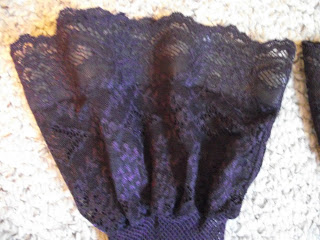
This is my product. I am really pleased with what I was given and I am feeling excited about starting my advert. I do realize that in this industry we will not always be fortunate enough to be asked to advertise a product that we want to advertise and I feel that this is the main reason for not being able to choose our own product.